What Are the Biggest Layout Mistakes in Commercial Interiors?
After a decade of sitting in sweltering job-site trailers, walking endless punch-list circuits, and listening to architects argue with MEP engineers about conduit runs, I’ve learned one immutable truth: you can have the most expensive bespoke joinery in the world, but if your circulation is broken, the office will always feel like a failure. We often obsess over the aesthetic finish—the "vibe"—before we address the geometry of the space. Before we talk about paint colors or the latest acoustic felt trends, I always ask: Where does the daylight come from, and how is it blocked?
Too many commercial projects today rely on the "Google and Apple effect"—copying the open-plan aesthetics of Silicon Valley titans without understanding the structural realities of their own floorplates. If you are ignoring your columns, your slab-to-slab heights, and your perimeter window placement until the finish schedule, you are already behind. Let’s break down the most common commercial layout mistakes that keep me up at night.
1. Ignoring the "Skeletal" Realities: Columns and Ceiling Heights
The most egregious mistake I see in early-stage design is treating the floorplate as a blank digital canvas. In reality, your layout is dictated by the structural grid. Designers who ignore the placement of columns often end up with "dead corners" that become literal trash bins for stray chairs and broken printers.
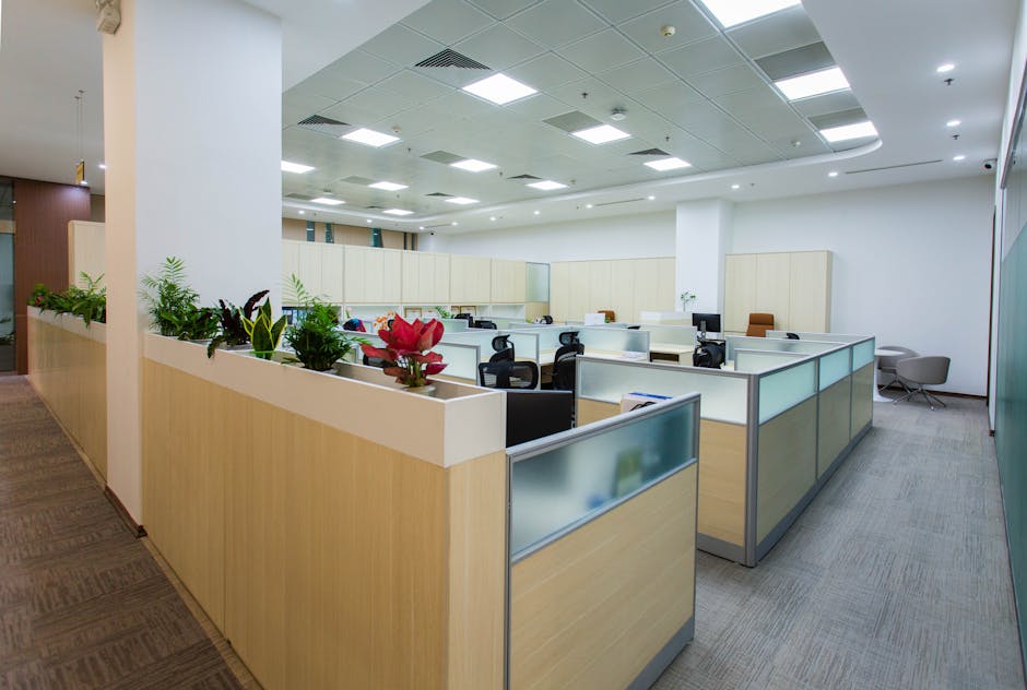
Before you commit to a desk arrangement, look at the ceiling plan. I have seen countless projects win accolades in forums like Rethinking The Future Awards 2026 for their "fluid" layouts, only for the actual construction to reveal that the heavy-duty HVAC ductwork clashes with the desired lighting placement. You cannot force a grand, open-concept floor plan into a building with a low, rigid structural grid. If your ceiling height is under 9 feet, stop trying to make "exposed industrial" happen; you’ll just end up with a cave.
2. The "Make it Modern" Trap: Vague Briefs and Functional Blind Spots
I cannot tell you how many times a stakeholder has told me they want the office to "look modern," like a Microsoft campus or a trendy co-working space. I always stop them right there. "Modern" is not a layout strategy; it is a style. When we chase an aesthetic without defining the work-flow, we end up with poor circulation.
Poor circulation is the silent killer of productivity. If the path from the kitchen to the boardroom cuts through the heart of the "deep focus" zone, interior circulation planning you haven't optimized your space; you’ve created a highway for distraction. When planning, use a traffic heat-map. If your most occupied desks are in the highest-traffic zones, you are fighting a losing battle against efficiency.
The "Small Fix" Checklist for Better Flow
- The "Anchor" rule: Place high-traffic zones (coffee stations, printers) near the core/elevators, not the perimeter.
- The "View Corridor": Never place tall cabinetry or storage between the windows and the center of the room. It kills the natural light penetration.
- The "Transition Zone": Use flooring transitions (change in material) to denote a shift from social to quiet spaces, rather than just relying on signage.
3. Bad Zoning: The Death of Privacy
We spent years swinging the pendulum toward total open-plan offices, and now we are dealing with the acoustic fallout. Bad zoning is rampant in modern commercial fit-outs. Putting the "collaboration hub" directly adjacent to the legal or accounting team is a recipe for high turnover and low morale.

Functional zoning is about understanding the "noise footprint" of every activity. I frequently refer clients to resources like Eduwik to study case-specific zoning configurations that prioritize sound attenuation without resorting to sterile, claustrophobic cubicles.
Strategic Zoning Hierarchy Zone Type Acoustic Expectation Ideal Placement Focus/Deep Work Silent/Low Ambient Perimeter away from high-traffic arteries Collaborative Moderate/Active Central hubs near main circulation Social/Breakout High/Noisy Corner pockets or near building service cores
4. Daylight Sabotage: Blocking the Light
Ever notice how architecture is light. Period. Yet, I walk into so many offices where the interior designers have placed glass-walled executive offices right against the window line, while the general staff sits in the dark center of the floorplate. This is an organizational disaster disguised as "hierarchy."
If you want to improve employee retention and productivity, you don't need a ping-pong table; you need a layout that allows natural light to hit as many desks as possible. If your interior glass partitions are blocking light, use high-transparency glazing or smart-film that clears only when in use. If you treat the window perimeter as prime real estate for private offices, you are squandering the most valuable amenity in the building.
5. Trendy Materials in High-Traffic Spaces
We see it every year—a material goes viral on design blogs, and suddenly every office wants it in the the lobby. I’ve seen porous, trendy stone countertops stained by coffee in week one, and "high-fashion" textile wall coverings shredded by chair backs in the main thoroughfare.
In commercial interiors, durability isn't just about money; it’s about the longevity of the space's design intent. When a space starts looking "tired" because the finishes couldn't handle the foot traffic, the entire office culture begins to reflect that neglect. Stick to commercial-grade materials that have been tested for abrasion and stain resistance. If the manufacturer can’t provide a wear-layer spec, don’t put it in your lobby.
Final Thoughts: The "Small Layout Fixes" Strategy
As you plan your next commercial project, remember that the most successful spaces—the ones that actually facilitate work—are built on logic, not just inspiration. Before you sign off on a design, do a walk-through in your mind:
- Where are the light sources?
- Is the person doing deep, quiet work separated from the person making sales calls?
- Does the circulation flow naturally, or are people forced to awkwardly weave through desk clusters?
This reminds me of something that happened thought they could save money but ended up paying more.. If you can answer those questions clearly, you’re already ahead of 90% of the projects I punch-list every year. And please, for the love of good architecture, if you find yourself using the phrase "make it modern" in a meeting, take a breath, open your floorplan, and identify exactly why the current layout isn't working for your people. Pretty simple.. That is where the real value is hidden.